Imagine running a digital launch event that grows your audience by 10 million users. Pretty exciting, yes? Now, can you imagine doing that much growth in a single day? Even more exciting is these are PAID users 👀
That’s pretty staggering even for the most seasoned veterans. And exactly the kind of numbers you would expect a global brand like Disney™ to pull.
In fact, for their launch of Disney+™ last November, they gained over 10 million paid users on day one (Source).

a conservative $69 MILLION USD on launch day.
$2.9 million per hour (assuming 24 hours).
While few can legitimately compete with a massive player like them, these results prove that with enough planning and hype around some particular date or time frame, you can make some big moves on launch day.
Being event geeks, we followed this launch closely to see what we could learn. We were especially interested in their email campaigns. So, naturally, we joined their mailing list as soon as it became available.
In this case study, we are doing a deep dive into each of the six emails we received, and the tactics we found.
Overall Email Launch Strategy: A Slow Burn Countdown
At the end of the day, this email strategy is an event countdown. The idea is to keep people warm and gradually excite them until the event itself. In this specific case, the event was being able to register for the new streaming service.
We signed up for the email list as soon as it became available. Unfortunately, they sent no confirmation email so the exact date we joined is unknown. As far as we are concerned, we received six emails between August 23rd and the November 12th launch date.
Six emails over close to three months is a super conversative sending pattern. If you look at the dates, they started towards the end of August. Then, they sent emails the first and last week-ish of every month until November 12th.
While we do not know exact numbers, we believe this kind of sending frequency to such a large list is a low spam risk. Especially since people are sharing their email in the first place for these notifications. Definitely something to keep in mind when it comes to building a general email list months in advance of a big launch.
Launch Email #1 – Friday August 23rd, 2019 @ 11:32 pm
Subject Line & Timing:
This first email uses a classic teaser:
“Exclusive Disney+ Originals coming soon!”
We suspect this email had a high open rate. It was the first email sent. The subject line itself says nothing while also being quite intriguing. We received it at nearly midnight on a Friday though. Perhaps the timing strategy was to catch people first thing on the weekend?
By starting the subject line with the word exclusive that immediately frames the message as exciting and cutting edge. Then, having “originals” and “coming soon” further drives it home.
This is a good reminder that subject lines exist to get the email opened and that’s it. By being direct about the subject, while still keeping the details close to the vest, they gave themselves the best chance for an email open.
The email itself is simple and dripping with information/value.

An elegant and effective design.
Content Breakdown:
Above the fold you have the “new” logo for the service (which is simply an extension of their primary brand). But, since this is a new thing, they further reinforce the value by dropping all their major brand IP logos underneath as well. All the cartoons and superheroes and whatnot.
Then, they immediately begin honoring the promise of the subject line; which is huge for email marketing to be effective. While at the same time, saying nearly nothing new.
“Introducing
Five Exclusive Originals”
Now we know there are five originals, when the subject didn’t reveal that information. Notice how they also chunked out the word ‘introducing’. Makes it easier to skim.
From there, they get into the first major call-to-action (CTA) to watch trailers, plural. And also tell the reader that the launch date is November 12th. So, from only opening the email, we now know the date and have more information about the offer. In this case original programming.
Continuing to scroll, the five originals are presented in a simple design. An image on one side and then a group of headline/text/button. To avoid visual repetition, they swap the image from left to right and vary between a black and blue background. Each section has its own CTA to view the specific trailer for that original show.
At the very end, they do a good job of reminding the reader to follow on the major social networks.
Analysis:
This is a textbook segmentation email. I’ll bet they were watching what trailers were being clicked as well as the view metrics themselves. It was smart of them to lead with The Mandolorian in the email as well, as that was their biggest flagship piece of original content with the most hype.
As far as launch countdown is considered, this email leaves us hungry for more which is exactly what you want to be doing with this kind of email strategy. The email send time was a little weird, but that may have been a function of their email system itself and not a tactical choice.
How To Use For Yourself:
This is a great first email for a new launch list. Informational and also gives people things to do.
If you have an event coming up, you can probably take this structure right off the shelf. Both the visual and message structure. Remember using minimal text because the main idea is to get people to other assets (like a trailer).
This means you’ll need to have those things live and running before sending this kind of initial launch email. So use this to celebrate internal milestones. The website is live? Great! Push people to these five pages using this email. Now the clock is ticking!
Launch Email #2 – Friday September 6th, 2019 @ 9:12 am
Subject Line & Timing:
This next launch email cuts directly to the point:
“Follow @DisneyPlus on Instagram, Facebook, and Twitter”
New social media to follow on Friday morning? Heck yes!
And for those who don’t use social media, they won’t even open this email. Which is ok. There will be more emails to come.
Again, this subject line doesn’t mince words. If you use any of those social media channels, and you want to follow them, you know exactly what to expect from this email.
We imagine this would help reduce unsubscribes from non-social readers since they weren’t “tricked” into opening an email they didn’t care about.
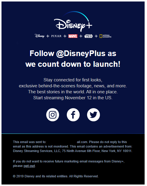
Short and sweet!
Content Breakdown:
This email is concise and to the point. A small glimpse into the types of content they are posting, and then links to the various social media outlets.
Notice how they keep the same above-the-fold logo with sub-brands. Just in case you forgot OR you joined the list after their last email.
Plus, they remind us of the launch date of November 12th. Which at the end of the day is the most important thing for us to know as the reader.
Analysis:
This is a very smart email to send after their first one. They knew they were going to get more email list growth after the hype around the first email. Which was about two weeks before this was sent.
So now, they’ve already released the trailers to kick it off. One of the next best things to do is get people cross-channel from email to social. And that’s all this email is trying to do.
How To Use For Yourself:
This kind of email should be a regular in your email marketing rotation. Especially for your lead generation efforts, sending a new lead an email like this a day or so after their initial opt-in can lead to steady social growth.
For a launch countdown specifically, definitely make sure you tell people to follow you on social! This is good to send early in the campaign, like they did here, so that you can hit them from multiple channels as the launch date approaches. Plus, getting social followers early in the campaign will also help with general awareness and reach.
Launch Email #3 – Sunday September 22nd, 2019 @ 5:45 pm
Subject Line & Timing:
As we’ve seen before, this next launch email cuts directly to the point:
“Pre-order Disney+ now!”
This was also the first email sent during a weekend AND in the afternoon. Considering this is the first “sales” email in the campaign, sending Sunday evening is smart. Good time to catch people as they are relaxing for an impulse buy.
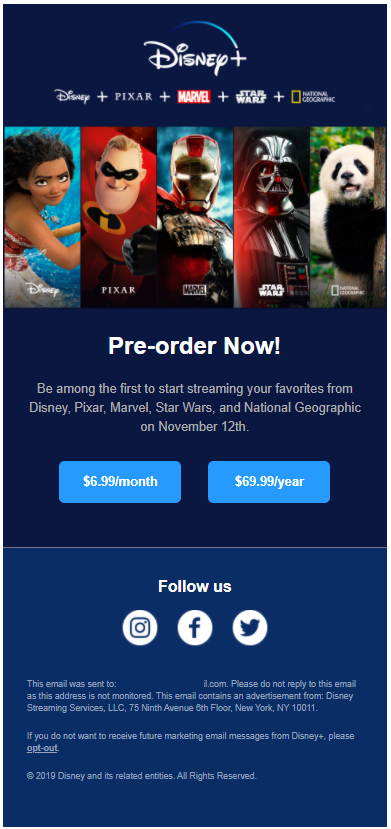
Another short and sweet email!
Content Breakdown:
This email continues with the same brand and sub-brand header. However, it actually extends into the next image showing characters from those five brands in the same branded order. It’s a subtle pattern, but it makes the message easier to visually consume.
Like the previous social invite email, this email gives a direct command. “Pre-order Now!”
Then, it layers on the social pressure to “be among the first to start streaming…”. Which, if you notice, also contains the embedded command, ‘be the first to start’.
Lastly, they close the sentence with “your favorites from…” which is presupposing you HAVE favorites and these are it. Again we are reminded of the launch date and given a simple choice: monthly or annual.
Analysis:
This is a solid sales email. It confidently assumes the sale and cuts right to “Do you want to get monthly or annual?”. If you have built up enough value by launch date, you can skip over the “Do you want to buy it?” question and get right into the payment details.
This is also the first time we see prices. At least in an email. Sharing the price at the same time you ask for the order, and no sooner, aids with an impulse purchase response. For those who are excited to buy, assuming the price is right, they can hop right into action. And for those who want to think about it more, now they can consider the service more seriously because they know the price.
How To Use In Your Business:
If you can do any kind of pre-sale for your launch or event, this is the kind of email to use somewhere in the middle of the campaign. No need for a long sales letter or cutesy writing. This is for those people who have been wanting to buy since day 1. Make it easy for them. We can work on “selling” the other people later as the event approaches.
This would not be a good first email in most cases as there needs to be a certain level of warming up first. If the audience has already been warmed up and educated on this specific offer, then yes this could be the first email in the countdown series.
The only thing we might test is putting the larger price first, and then the smaller monthly price. This way, we are presenting the bigger number first. Such that, the next number is smaller by comparison. Starting off with the biggest “price shock” and then dropping down to frame the smaller number of the monthly option.
“$70? That’s pricey but $7 is more reasonable.”
The way they have it in this email, you start with a small price and then go up.
“$7? That’s reasonable but $70 is more pricey.”
It’s a subtle sales psychology thing that feels different if you start with the bigger number instead of the smaller number. Definitely worth testing for yourself!
Launch Email #4 – Monday October 7th, 2019 @ 9:28 am
Subject Line & Timing:
The theme in this launch is that the subject lines cut directly to the point. Here’s the fourth email they sent:
“Why wait? Pre-order today”
This email is the perfect Monday morning distraction for an impulse buy. Especially since the launch is in about a month from this email, there is less time to wait.
By asking the question of ‘why wait?’, it allows the reader to answer in their own head. Hopefully the reason/excuse is weak and that’s all they need to consider a buying decision and open that email.
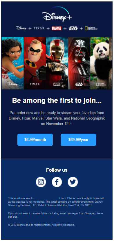
Hey! This looks awfully familiar…
Content Breakdown:
This email is nearly identical to the previous one. A direct sales email.
In fact, they leverage the same kind of “be the first” social psychology. Considering the launch was still a month out from this email, it’s still a valid influence lever to pull.
Analysis:
We could see this as being the first email to get some serious unsubscribes and spam complaints. It’s the same as the previous one from a few weeks ago. If someone has been following the launch, they might not appreciate such repetition.
The subject line is also subtly different from the previous yet very much the same. They are still saying to pre-order now, but in slightly different ways. This email’s subject line is more of an inquiry where the previous was a direct command.
As far as being a sales mechanism, it’s still right on the money!
How To Use In Your Business:
The main takeaway here is they sent (basically) the same sales email twice, but a few weeks apart. You can do the same. Especially for pre-sale stuff, you want to remind people to buy now and not wait.
Be careful with the timing though! Again, they waited a couple weeks before sending the same email. If you don’t have that much time, you can still send sales emails but make sure they are a little different each time.
Launch Email #5 – Monday October 28th, 2019 @ 6:51 pm
Subject Line & Timing:
Subject lines that cut directly to the point? Check! Sending this email Monday evening when most folks are winding down from the start of their week? Genius:
“The NEW Mandalorian Trailer is here.”
The last two emails were direct pushes to buy, so here they mixed it up by releasing a NEW trailer. Again, The Mandalorian was the biggest hype of this launch, so if anyone was interested in that series they were absolutely going to open up this email.
Even if someone wasn’t a fan of that universe, and they never open the email, they still might see the subject and preheader. Which is still a reminder of this new service coming soon on a specific date.
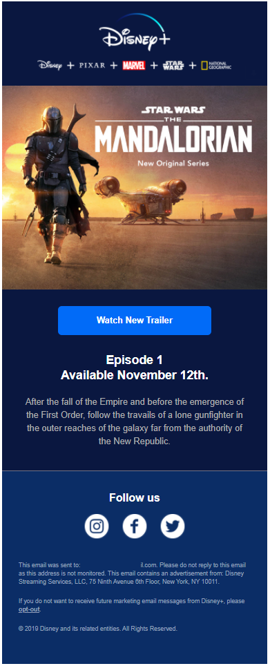
For a fan, this is an exciting, must-click, email!
Content Breakdown:
Staying with their consistent header, they present a big visual headline for the new show. However, it’s still nothing new because this was the same image used in the original launch email back in August. Sneaky sneaky 😉
The main CTA is to watch the trailer with some supporting text that frames the new story of the series.
Analysis:
This email leverages the human appeal towards new things. For launches & events, hyping up the “new” is a sound tactic and this email is a great example. We bet this email had a high click-to-open rate.
Notice the email says nothing about the service, much less buying it ahead of time. So even though this is still a launch email, it is similar to the earlier ones there were pure information and value.
Yet, they are still giving us a subtle clue to buy with a reminder that the content is “Available November 12th”. They assume the sale and that the reader is going to take advantage of that availability when it goes live.
This educational email is short and sweet and most likely drove many trailer views.
How To Use In Your Business:
The lesson here is to not play your whole hand leading up to a launch.
Could they have released both trailers in August? Probably. But then they would have lost an excuse to email and hype it up again before launch.
When developing big elements of your event or launch, and the marketing to promote it, keep in mind how your email strategies may fit in. Large/key content pieces can be released over time to keep the conversation going.
In fact, this is super common among internet marketing launches. They will have a series of videos leading up to a big open cart event. And they release those videos over a period of time to keep the hype alive.
Launch Email #6 – Tuesday November 12th, 2019 @ 1:29 pm
Subject Line & Timing:
If you haven’t bought now, or were waiting until the service was live, this is your email! Sending just after lunch on a Tuesday:
“Disney+ is now live!”
You can’t be any more direct than this simple, direct subject line. And while some people probably woke up that day knowing they could buy, this email is a great reminder in case someone forgot!
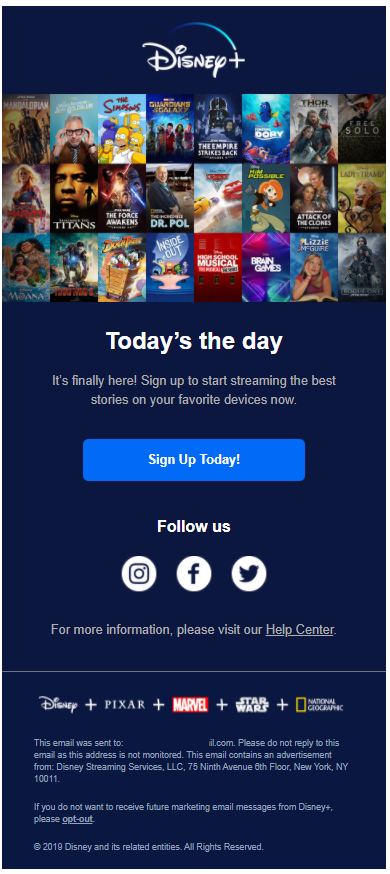
Finally! After all these months 😥
Content Breakdown:
For the first time since this campaign began, we no longer have the sub-brands under the main logo. Instead, we have a wall of all the available great content that is (finally) ready to watch. The sub-brands can still be found in the footer however.
As we have seen with all previous emails, the CTA is a function of some headline, some text and the main button. They capitalize on the excitement by proclaiming “Today’s the day” and “It’s finally here!”.
To take the pressure off the sale, they immediately downsell with a friendly (and free) “Follow us” on social media.
Analysis:
This is a classic “ring the dinner bell” launch email. The cart is open! Go buy! Doesn’t need to be anything long or fancy because we’ve been hyping it up this whole time.
Notice how for the visual headline, the best and strongest IP is focused in the upper left corner. People typically read from left to right in an ‘F’ shape so this visual takes full advantage of this built-in behavior.
A visual such as this is extremely smart to really sell the service. Give the people what they want. It is interesting the Jeff Goldblum series is next to the corner. Perhaps this was the most clicked-through trailer from the previous emails?
Also, notice how they slickly handle (what we imagine would be) one of the biggest objections which is “Will this work for my device?” They plainly say streaming on your favorite devices, which means it should be compatible with my device as the reader.
For sales emails, if you can get ahead of objections to the sale, you are in great shape to close the deal.
What About Automated Follow-Up?
We are huge fans of behavior-based automated follow-up. For example, sending another email if someone clicks to view a trailer that provides extra insight.
Considering this was a global brand, it wouldn’t be unreasonable to expect they might have some automation on the backend.
We went into this knowing we wanted to do a case study, so we intentionally did NOT click on anything. Ever. If we had clicked, we might have gotten some different or more emails.
Instead, by choosing to never click, we got a fantastic glimpse into what an international conglomerate would do for a cold email series to someone completely unengaged who only joined the list.
From an automation standpoint, developing a short-term 6 email series like this is completely feasible. Then you can bolt on behavior-based elements like cart abandons and social ad syncing. FTo turn up the urgency, one could even use a real-time countdown timer in the emails somewhere. This way the clock is ticking alongside the reader no matter when they might open the email.
There is also an opportunity for personalization. Done right, a first name can make the email feel a little more magical. Of course, by only collecting an email address for the waitlist, there is less resistance for the initial opt in. In Disney’s case, we imagine the goal was to build the biggest email list possible, so the reader’s name is not technically required.
Key Best Practices
This email marketing launch is a textbook study in solid, fundamentals:
- Each message does something different, and intentional, AND still works together as a series of emails.
- The series still makes sense if someone joins mid-way through the campaign.
- The subject lines are direct and to the point.
- The timing is varied to different days and times of day; they actually alternate between AM and PM except for the last email if you go back and look.
- The visuals are professionally designed and the email layouts are modern and uncluttered.
- The emails are designed for mobile viewing.
- The calls to action are clear and simple.
- They make sure to work cross-channel with social media.
Six emails doesn’t seem like much. But when you lean in and examine what happened over those few months, it’s easy to see why the launch was a success.
Did these emails alone drive 10 million paid users on day 1? No. There was lots of other online and media coverage to drive awareness and hype. These emails absolutely did their sales job, however, of nurturing a new email address into a paying customer (hopefully).
Of course, never forget the Offer is the most important thing. The offer being made by Disney+™ is extremely strong, so the email marketing is easier. Make your offer the best it can be, and it will sell itself with minimal persuasion.
So there you have it! The six emails that helped drive Disney+™ to a 10 million paid user launch on day one. What was your favorite email? What stood out to you? How do you see yourself or your business using these ideas?
